Designing with Variable Fonts
A new kind of font
Variable fonts are an evolution of the OpenType specification. They let you use CSS to access all the styles contained in a single font file without worrying about browser distortions like fake bolds or italics.
Previously, using multiple styles meant loading multiple files—one for every width, weight, or italic. This created tension between design expressiveness (the number of fonts used) and website performance (the amount of data to download). With variable fonts, that whole equation changes.
Now you can use as many variations of a font as you like without slowing down your site
What’s an axis?
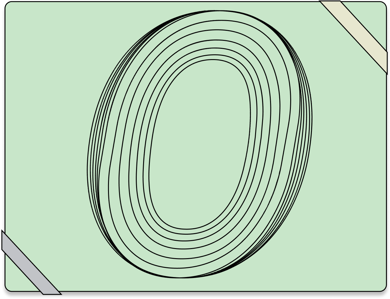
A variation axis is the expression of a single aspect of a typeface’s design.
The weight axis, for example, defines how light or bold a font looks. With standard fonts, the terms “normal” and “bold” refer to specific files that are called to serve those styles. With variable fonts, weight is conveyed through minimum and maximum numeric values, and designers or developers can choose any value in between.
Not every variable font will have every possible axis (weight will likely be the most popular), but the format, browser implementation, and operating systems guarantee they’ll all work as intended.
Axes are divided into 2 types, registered and custom. While there are currently 5 registered axes, type designers can define their own custom axes, creating any kind of variations they can dream up. There are fonts with custom axes for grade, expressiveness, the ascender and descender height of lowercase letters, and countless more. The format itself is purposely left open to allow this sort of innovation.
In the CSS, the abbreviations of the registered or conventional axes are written in lowercase, and the abbreviations of custom axes are written in uppercase.
The registered axes map to standard CSS attributes. Custom axes can be referenced using the new CSS attribute font-variation-settings.
| Axis & Abbreviation | CSS attribute |
|---|---|
Weight (wght) |
font-weight |
Width (wdth) |
font-stretch |
Italic (ital) |
font-style |
Slant (slnt) |
font-style |
Optical size (opsz) |
font-optical-sizing |
Why this matters
Downloading a single file instead of multiple individual fonts can yield a significant performance gain in reduced file size and fewer file requests.
Variable fonts are better for web and mobile apps
Since that single file includes the entire design space instead of a few very specific weights or other variants, the design vocabulary is much greater. Instead of only 1 or 2 weights, the entire available range can be referenced directly via CSS—from extra-light to extra-heavy, narrow to wide, upright to italic.
Effective use of type generates greater clarity and hierarchy, which benefits both design and user experience. There are accessibility benefits, too, like providing a way for users to increase font weight and color contrast to help with low vision, or making subtle adjustments to the typography for a dark-mode implementation for people who are sensitive to light.
Weight
Many typefaces are designed with at least regular and bold weights, and quite often with much lighter/thinner and bolder extremes.
With a variable font, the standard CSS attribute of font-weight can be used with a number somewhere between the minimum and maximum value defined for the font. This allows far greater flexibility and precision in specifying weight than just a keyword like “normal” or “bold”. According to the OpenType specification, 400 should equate to normal for any given font. In practice, though, that varies quite a bit from typeface to typeface.
  p {
    font-weight: 425;
  }
  strong {
    font-weight: 675;
  }
Weight
      .text {

          font-weight: ;

      }
Why this matters
A broader range for design elements, like an extra-thin weight for big quotes or a super-heavy one for extra emphasis, is very useful. It’s also worth experimenting with what it means for something to be “bold.”
Using a slightly less bold value for bold text inline with body copy (i.e., the strong tag) can bring more legibility to emphasized text while still standing out. With heavier weights, characters tend to close up, so being just a little bolder at smaller sizes can still provide emphasis while preserving openness. Try setting strong to a font-weight somewhere between 500–600 instead of the default 700.
Width
Width in typeface design is often expressed in terms like “condensed” or “compressed” or “extended”—though the exact meaning of those words is subjective. These terms all refer to how relatively narrow or wide a font is in relation to the “normal” design.
According to the specification, 100 should equate to a “normal” width, and valid values can range from 1 to 1000. Like weight, it maps to an existing CSS attribute, in this case font-stretch, and is expressed as a percentage.
In these early stages of adoption, many type designers and foundries have not necessarily adhered to this standard. Number ranges like 3%–5%, while still valid, can look a little odd in your CSS (in this case 5% is actually the normal width). Hopefully over time more standardization will emerge.
  p {
    font-stretch: 89%;
  }
Width
      .text {

          font-stretch: %;

      }
Why this matters
Making sure larger headlines don’t end up fitting only one or two words per line can be a challenge on smaller screens. In addition to adjusting font-size based on viewport size using techniques like media queries or viewport units and calc(), a width axis can make headings slightly narrower, fitting more words per line without having to make the font-size even smaller.
Italic
The italic axis is fairly straightforward. In most cases it’s a boolean 0 or 1: off ( upright) or on—usually meaning slanted strokes and sometimes glyph replacements (the lowercase a and g often have different italic forms, for example).
It’s possible to have a range rather than strictly 0 or 1, but the off/on scenario is the most common.
Unfortunately, while it is intended to map to font-style: italic, this is one of the areas where browsers have not fully resolved the implementation. If you have separate variable font files for italic and upright (such as when you are referencing them from the Google Fonts API), then you can use the standard font-style: italic syntax.
        .italic-text {
          font-style: italic;
        }
If, however, you have a single variable font that contains both italic and upright axes, it’s necessary to use the lower-level syntax of font-variation-settings. This is a good case for using a CSS custom property so that you can alter only the italic/upright setting without having to redeclare the entire font-variation-settings string.
  :root {
    --text-ital: 0;
  }
  body {
    font-variation-settings: 'ital' var(--text-ital);
  }
  em {
      --text-ital: 1;
  }
Italic
      .text {

          font-style: normal;

      }
Italic
      .text {

          font-variation-settings: 'ital' ;

      }
Why this matters
Having italics available alongside the upright forms is useful when combined with weight to handle everyday needs for body copy, requiring only 1 or 2 files instead of at least 4. Combined with the range of additional axes available in some typeface designs, there may be no need for other fonts at all.
Slant
The slant axis is similar to italic, but differs in two key ways. First, it’s expressed as a degree continuum, and according to the OpenType specification should be “greater than -90 and less than +90”; and, second, it doesn’t include glyph substitution. Usually associated with sans serifs, it allows for any value along the range specified. If the font in use only has a slant axis and no italics, use the standard attribute of font-style, like so:
  em {
    font-style: oblique 12deg;
  }
If the font in use has both slant and italic axes, then you have to use font-variation-settings. In this case, it’s just a numeric value without the deg nomenclature.
  :root {
    --text-slnt: 0;
  }
  body {
    font-variation-settings: 'slnt' var(--text-slnt);
  }
  em {
      --text-slnt: 12;
  }
Slant
      .text {

          font-style: oblique deg;

      }
Why this matters
The slant axis allows for anything within the defined range. Opportunities abound to set the angle a little differently, or to add animation so the text slants just a little after the page loads. It’s a unique way to draw attention to a text element in an understated way.
Optical Size
The practice of optical sizing evolved in the sixteenth century, back when punchcutters were carving type out of metal by hand. It entailed cutting physically smaller type with slightly thicker strokes and less contrast to ensure it would print well and be legible at smaller sizes. Other aspects could be fine-tuned as well—apertures could become wider, terminals more angled, bowls enlarged. Conversely, larger point sizes would be cut with greater finesse, allowing for heightened contrast and intricate details. This allowed a single typeface design to work optimally at a range of physical sizes.
The practice of optical sizing was lost, however, with the shift to phototypesetting and then digital type. Both of these newer practices involved taking a single outline and scaling it up or down. The fine details that appeared so graceful at larger sizes grew muddy or even hampered legibility when type was scaled down; sturdier type that worked well in running text at smaller sizes became spindly and frail (especially on early lower-resolution screens) when scaled up. Regaining optical sizing in the form of a variable axis restores tremendous range to individual designs.
The concept is that the numeric value for this axis should match the rendered font size, and a new attribute was introduced to go along with it: font-optical-sizing. The default is auto, and this is supported behavior in all shipping browsers. You can force it to off, or you can set an explicit value via font-variation-settings.
  body {
    font-optical-sizing: auto;
  }
Or:
  :root {
    --text-opsz: 16;
  }
  body {
    font-variation-settings: 'opsz' var(--text-opsz);
  }
  h1 {
    --text-opsz: 48;
    font-size: 3em;
  }
Optical Size
      .text {

          font-optical-sizing: ;

      }
Optical Size
      .text {

          font-variation-settings: 'opsz' ;

      }
Why this matters
A good optical-size axis makes type more legible at smaller sizes. Tailoring it to the size at which it’s used makes a remarkable difference. On the other end of the spectrum, increased stroke contrast (and anything else the type designer decides to vary) means a single font can feel completely different when used smaller for body copy and larger for headings. The variable version of Roslindale (from David Jonathan Ross’ Font of the Month Club) in use on RWT.io (December 2019) showcases what a big impact this can have. The site uses a single font for both headings and body copy, yet they feel completely different in width, weight, and stroke contrast.

Slant & Italics
It’s unclear if the creators of the variable font specification were thinking of this when it was written, but technically there is no reason there can’t be separate axes for slant (i.e., angle) and italic (i.e., glyph substitution). Indeed, both David Jonathan Ross and Stephen Nixon have done just that, with Roslindale Italic and Recursive, respectively. With Recursive, it’s apparent how much flexibility can be achieved by separating the angle change from the glyph substitution. It can impart a completely different feel to a block of text to have an angle without the alternate forms. With the state of italic implementation and the fact that they share the same CSS attribute, this is a situation that requires the use of font-variation-settings in order to set the attributes separately.
  :root {
    --text-ital: 0;
    --text-slnt: 0;
  }
  body {
    font-variation-settings: 'ital' var(--text-ital), 'slnt' var(--text-slnt);
  }
  em {
     --text-ital: 1;
     --text-slnt: 12;
  }
  .slanted {
     --text-slnt: 12;
  }
  .italic-forms-only {
    --text-ital: 1;
  }
Slant & Italic
      .text {

          font-variation-settings: 'slnt' , 'ital' ;

      }
Why this matters
Having these axes separated offers greater design flexibility when creating typographic systems. In some cases, slant alone may be the best option; in others, both angle and glyph substitution may be desirable. Although not the most critical of features, it does add an extra dimension to the utility and dynamic range of a font.
Custom Axes
Because there are so many examples of custom axes, it’s impossible to cover them all here. Nick Sherman’s v-fonts.com is a good place to browse if you want to see what sort of variety exists. Let’s focus on examples of a few custom axes that highlight usage for accessibility and UI improvements, and that also give you creative latitude with typographic systems and expressiveness.
Grade
Grades were first introduced to compensate for ink gain on different kinds of paper and presses. They act as a sort of “equalizer”—a way of visually correcting a typeface across workflows so it appears the same in every environment. A grade alters the weight of a font without changing the overall space the text occupies. Having this as a variable axis can be useful in a couple of ways. Creating a higher-contrast mode, where the text gets slightly heavier without reflowing, can make text more legible in low-light situations or in designing for “dark mode.” And when animating interface elements, this axis can add a heavier text grade along with a background-color shift on hover, tap, or focus.
It can also be handy for responding to low-resolution screens, where type can easily become spindly. Note that as with other custom axes, the abbreviation needs to be specified in all caps.
  :root {
    --text-grad: 0;
  }
  body {
    font-variation-settings: 'GRAD' var(--text-grad);
  }
  body.dark {
    --text-grad: 0.5;
  }
Grade
      .text {

          font-variation-settings: 'GRAD' 0;

      }
Why this matters
Likely the most significant use of a grade axis will be for accessibility—designing a dark or high-contrast mode, for example. But it will also work well in UI animations, like making text heavier on buttons or navigation on hover or focus without altering the physical space occupied by the text.
Casual
The variable font Recursive has 5 different axes, but the custom one we’ll focus on here is called Casual. It makes the font shift from a typical sans serif design to one that looks more like freehand sign-painting.
  :root {
    --text-casl: 0;
  }
  body {
    font-variation-settings: 'CASL' var(--text-casl);
  }
  .casual {
    --text-casl: 0.95;
  }
Casual
      .text {

          font-variation-settings: 'CASL' 0;

      }
Why this matters
Some might not see the value in this axis, but it does let you introduce a vastly different feel to a block of text (like headings, perhaps) without loading a second font. This gives the design vocabulary tremendous range.
Ascenders & Descenders
This custom axis alters the height of the ascenders and descenders of lowercase letters. These are the parts of letters that “ascend” (the tops of b, d, t, and h) and “descend” (the bottoms of p, q, g, and y). This axis is useful for adjusting how expressive a block of text feels and for setting text without a lot of space between lines. The variable font Amstelvar has two custom axes: YTAS for ascenders and YTDE for descenders.
  :root {
    --text-ytas: 750;
    --text-ytde: -240;
  }
  body {
    font-variation-settings: 'YTAS' var(--text-ytas), 'YTDE' var(--text-ytde);
  }
  .shorter {
      --text-ytas: 675;
      --text-ytde: -138;
  }
  .taller {
    --text-ytas: 825;
    --text-ytde: -500;
  }
Ascenders & Descenders
demanding
      .text {

          font-variation-settings: 'YTAS' , 'YTDE' ;

      }
Why this matters
It’s common to set large text blocks very tightly. Reducing the length of ascenders and descenders allows lines of text to be set very closely together without the descenders on one line crashing into the ascenders of the line below.
Next steps
Congratulations! You’re well on your way to understanding the power and flexibility of variable fonts. They may not always be the most appropriate solution, but in many cases they can offer substantial benefits. Take a look at Implementing Variable Fonts to give them a try and see how to incorporate them into your own projects, and have a look at the resources section for more links, articles, and tutorials to explore.